Role
Brand Visual Designer
Duration
December 2021-September 2022
Skills Involved
Visual Design, Packaging, Collateral
Tools
Illustrator, Photoshop
Team
TEALEAVES In-House Design Team
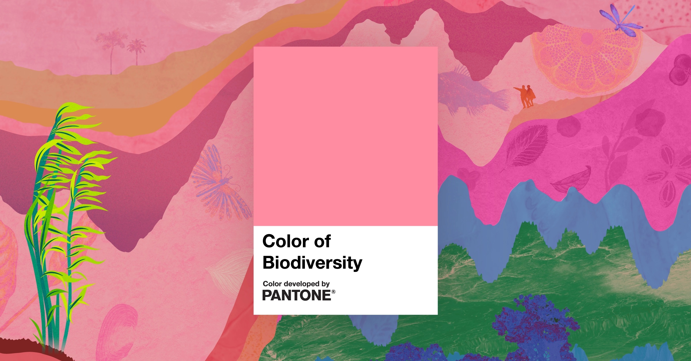
Color of Biodiversity With the Pantone Color Institute, TEALEAVES created a vibrant color inspired by the oldest pigment on Earth and aims at drawing attention to biodiversity loss.
Overview A collaboration between Pantone Color Institute and TEALEAVES in support of United Nations Biodiversity and World Biodiversity Forum. Pantone Color Institute developed a color inspired by the oldest pigment on Earth: a vibrant pink. The Color of Biodiversity is used as an amplifier and educational tool and has helped to share the future plan for healing and protecting nature in the 2022 UN Biodiversity conference COP15.
I had the amazing opportunity to conceptualize and design an original graphic for the Color of Biodiversity, including the primary hero image and other marketing collateral, as well as extend the visual identity to the packaging for the Color of Biodiversity tea.
Role
Brand Visual Designer
Duration
December 2021-September 2022
Skills Involved
Visual Design, Packaging, Collateral
Tools
Illustrator, Photoshop
Team
TEALEAVES In-House Design Team
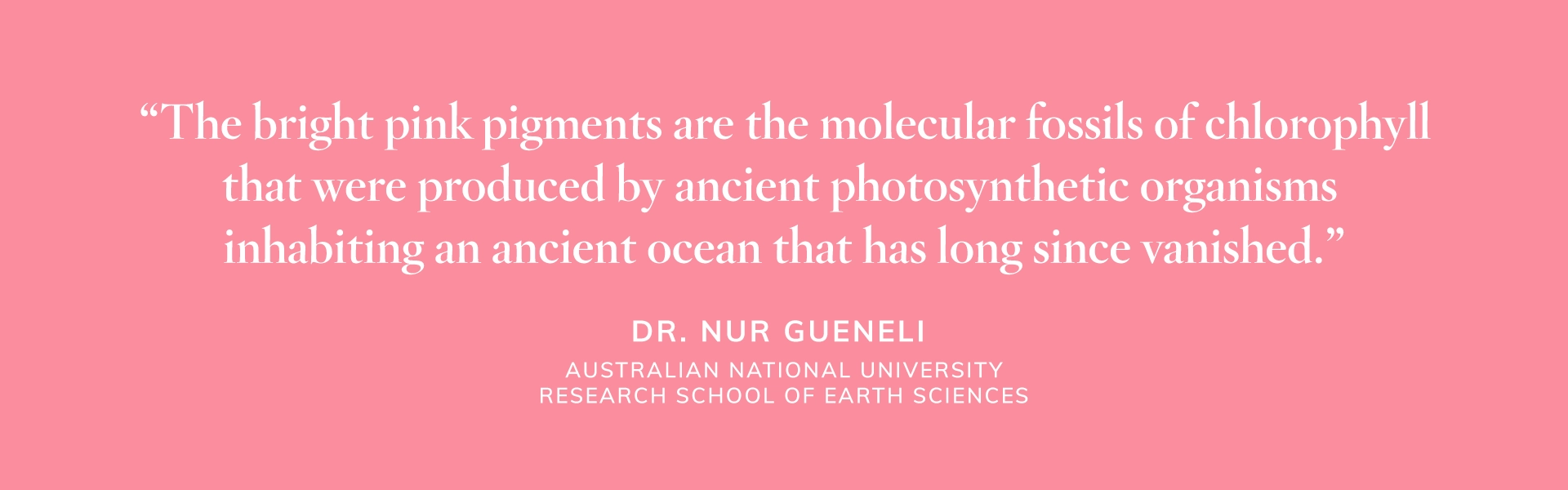
Color OriginPantone Color Institute selected a color emblematic of the oldest pigment on earth which was discovered in 1.1-billion-year-old marine sedimentary rocks of the Taoudeni Basin in Mauritania, West Africa, by Dr. Nur Gueneli. A bright pink hue, the pigment results from microscopic fossils of chlorophyll produced by ancient species living in an ocean that no longer exists.
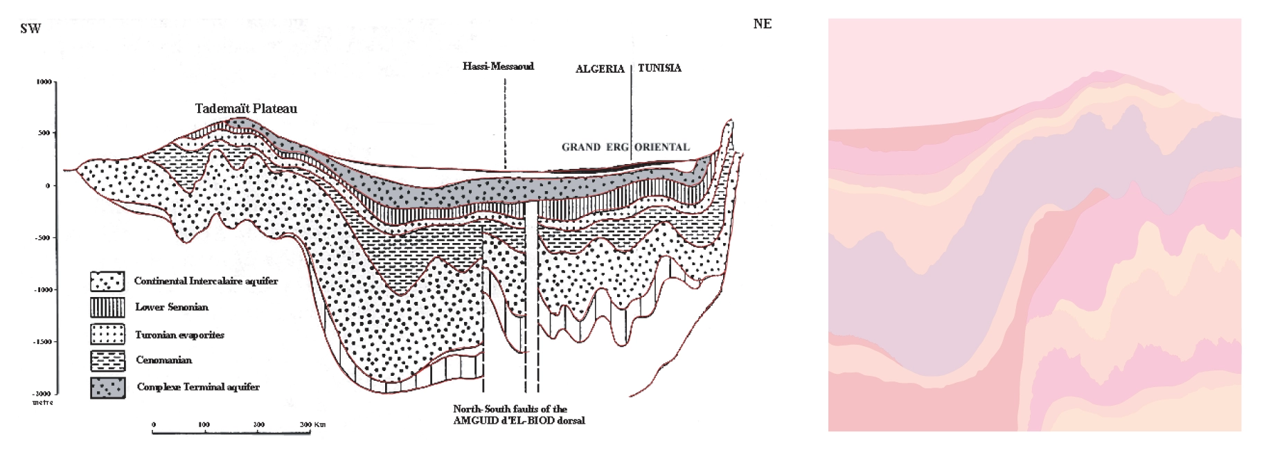
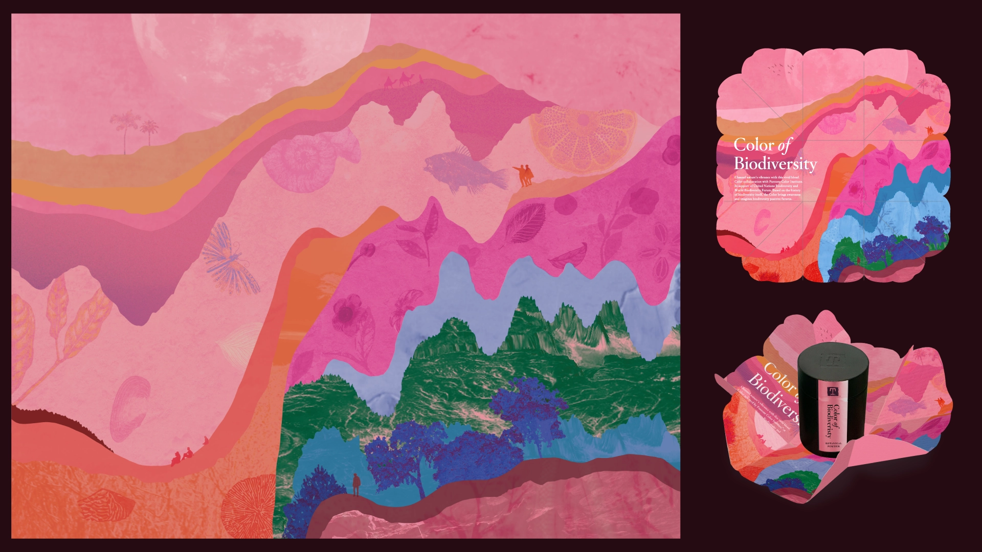
GraphicsThe layers are a reference to the cross-section view of the sedimentary layers of the ancient Sahara Desert, specifically the [Taoudeni Basin in Mauritania] where the scientists have discovered the fossils where the pink pigment are collected from.
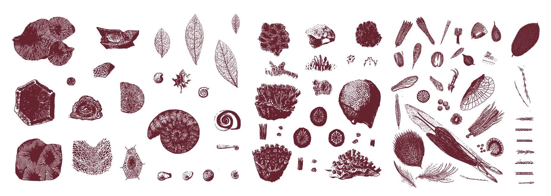
The magnification of the dissected layers are an attempt to add history to the origin of life by showing evolution - fossils at the bottom transitioning to rocky landforms, lichen, trees, people and other creatures towards the top. The undulating patterns and textures are enhanced by the graininess and organic shapes of the graphic elements.
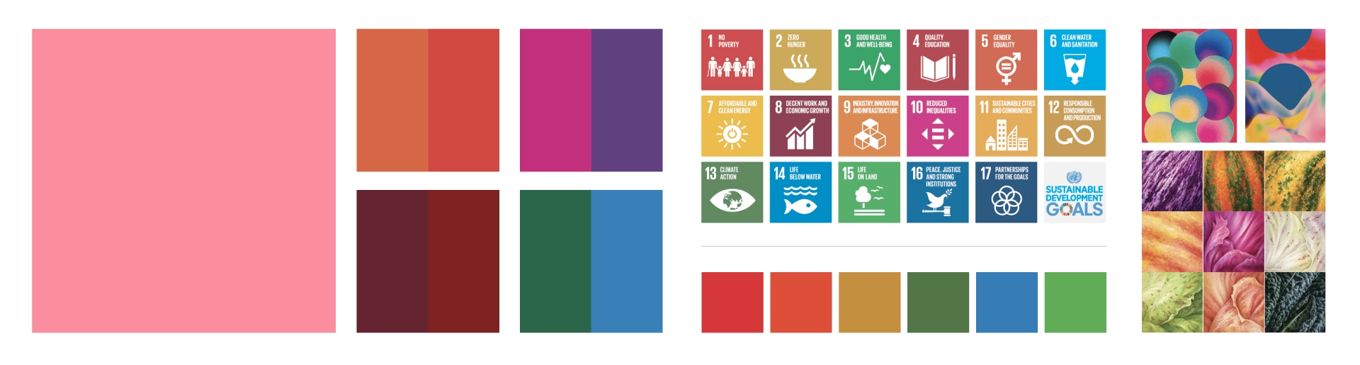
Colour PaletteAside from the prominent use of the Color of Biodiversity pink hue, some of the colours in the palette are influenced by the palette of the Sustainable Development Goals.
It was also intentional that the layers the artwork begin and end with the Color of Biodiversity colour to give reference to it being an ancient colour used to bring attention to biodiversity loss in modern times.
Design DecisionsOverall, the intention was to maintain a lively tone with the artwork, to imbue the work with optimism for the future, and to keep the mood uplifting and energizing instead of bleak and cynical.
To give it a sense of playfulness and whimsy, we included minuscule details for the viewer to localize in the different “ecosystems”. We incorporated human and animal silhouettes throughout the artwork to allude to humanity, and good health and growth of living beings. We hope to symbolize the variety of species and interconnected ecosystems that give the Earth its brilliance.
TakeawayIt was an incredible honour to have the opportunity to work on this social impact project with Pantone Color Institute and United Nations Biodiversity at this point in my design career. It was such a team effort to put together this campaign and very proud of the team and the outcome.
I think it will be exciting to see the richness of how the application of the Color of Biodiversity can be used, and how it can be used to spark discussion and new ideas in the community. It has been interesting to see how people have connected and related to the Color.