Specific Role
Brand Visual Designer
Duration
December 2021-June 2022
Skills Involved
Visual Design, Packaging, Collateral, Web Design
Tools
Illustrator, Photoshop
Team
TEALEAVES In-House Design Team
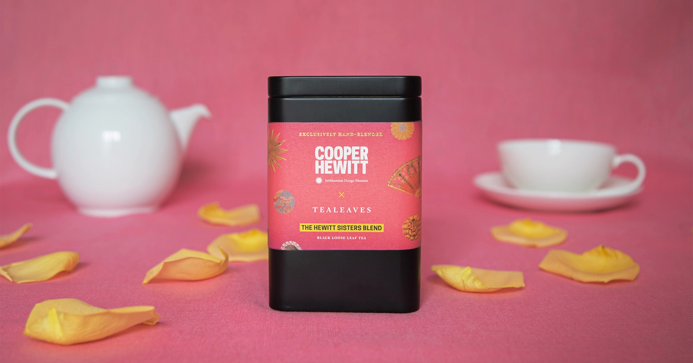
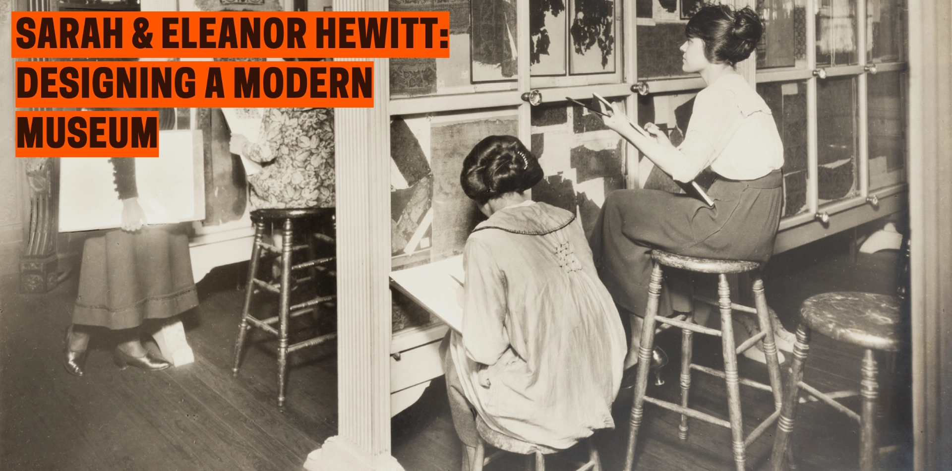
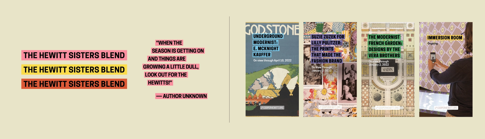
The Hewitt Sisters Blend A limited edition blend co-designed with Cooper Hewitt, Smithsonian Design Museum. Celebrates the museum’s 125th anniversary, its brilliant founders, and the exhibition - Sarah & Eleanor Hewitt: Designing a Modern Museum.
OverviewWe had the opportunity to collaborate with Pamela Horn, Director of Cross-Platform Publishing and Strategic Partnerships at Cooper Hewitt Smithsonian Design Museum, to work on a special project. Our task was to create a packaging label design commemorating the museum's 125th anniversary - a project that was exclusively commissioned for the occasion. Our goal with the graphics was to celebrate and capture the essence of the Hewitt sisters and make the packaging in its entirety feel like a museum piece.
Specific Role
Brand Visual Designer
Duration
December 2021-June 2022
Skills Involved
Visual Design, Packaging, Collateral, Web Design
Tools
Illustrator, Photoshop
Team
TEALEAVES In-House Design Team
Credit
Product Photography: Aghavni Vardanyan
ProcessFor this project, I had the pleasure of being the lead on the Cooper Hewitt retail tin label design. Our approach to the label design was to use artifacts from Cooper Hewitt's collection, tapping into physicality and the concept of Enduring Design and Archival Design to tell the stories of the Hewitt sisters.
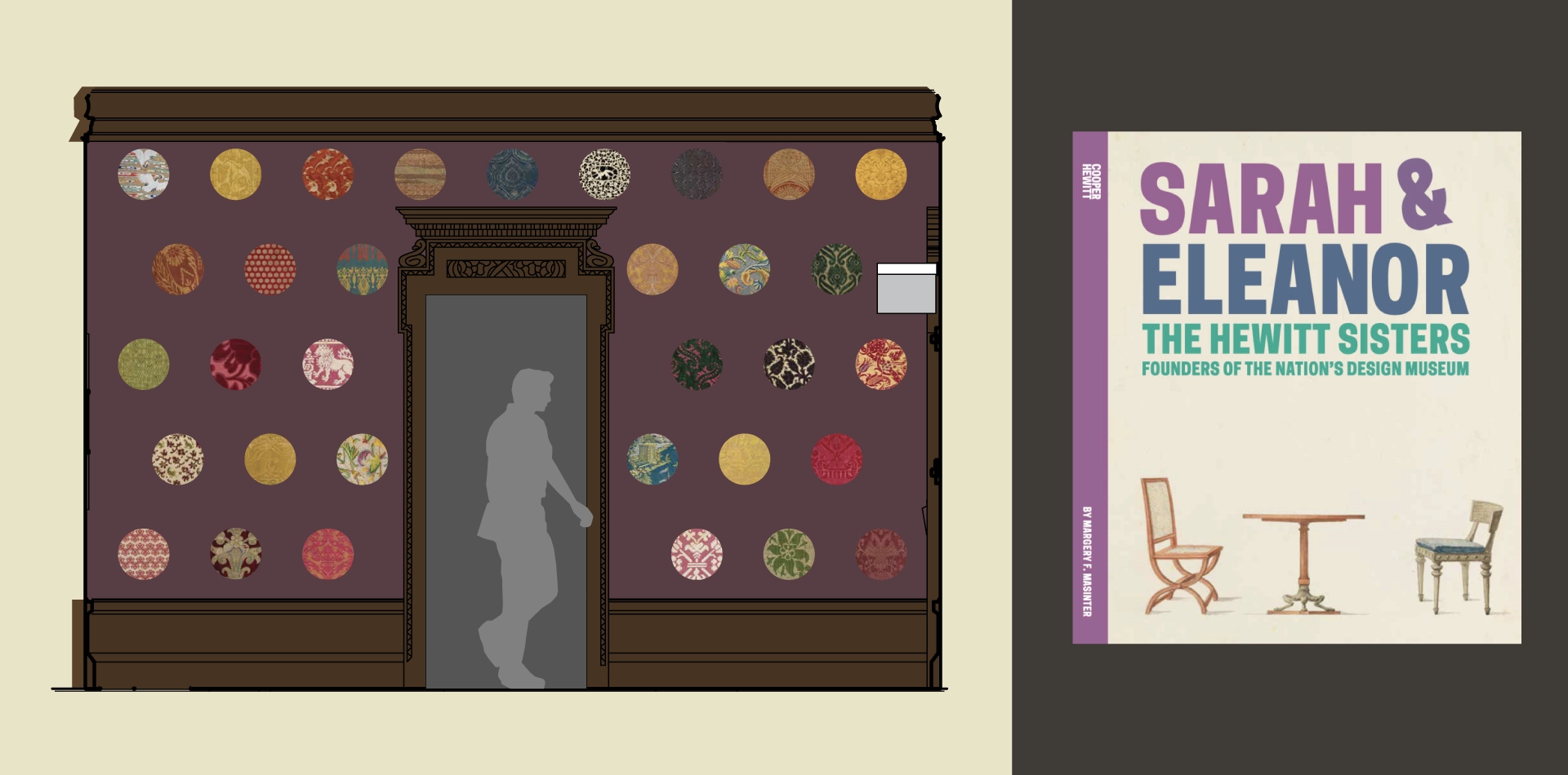
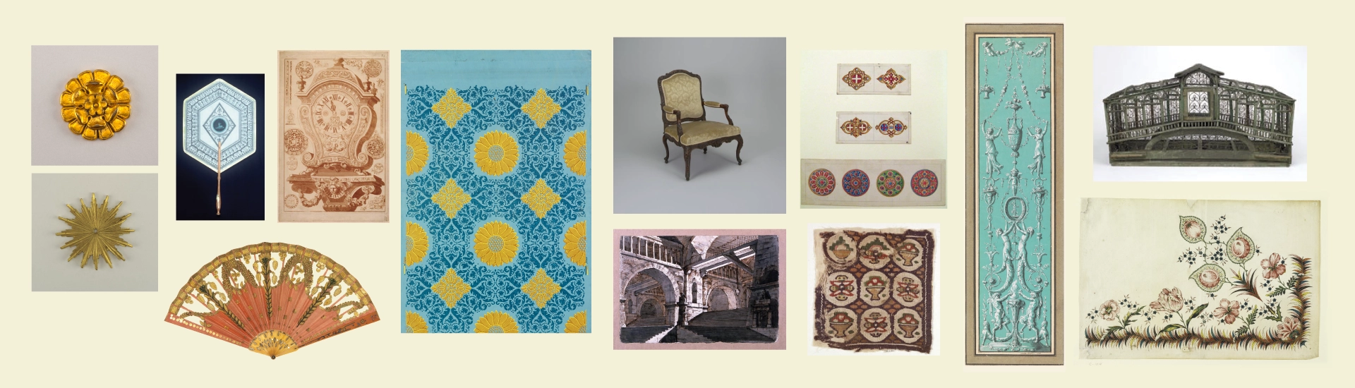
Inspired by the wondrous stories told about the sisters, we incorporated particularly intriguing specimens of art from their diverse collection, spanning from textiles and buttons to decorative engravings and mounts, etchings, and birdcages. The label was designed to manifest an imaginative expression, going beyond the typical, stoically antiquated visual language of museums.
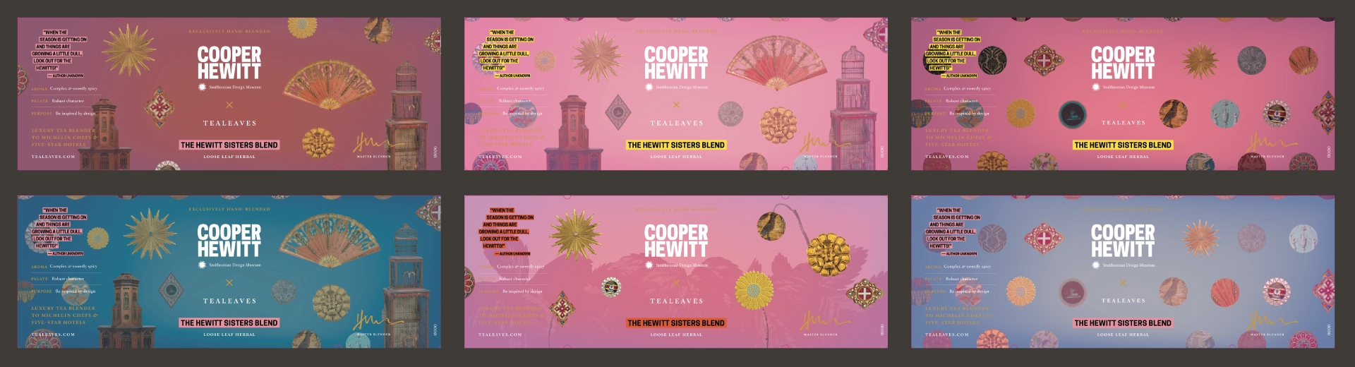
Design DecisionsTo achieve this, we used a vibrant color palette with a composition of bold geometric shapes and prints, resulting in a label design that was both playful and sophisticated. The custom Cooper Hewitt typeface, which is widely used across the museum's graphics and is available for free to the public, was also incorporated into the label design. The typography was reversed out of a colored block for universal accessibility, reinforcing the museum’s unique graphic identity on the packaging for the anniversary celebration.
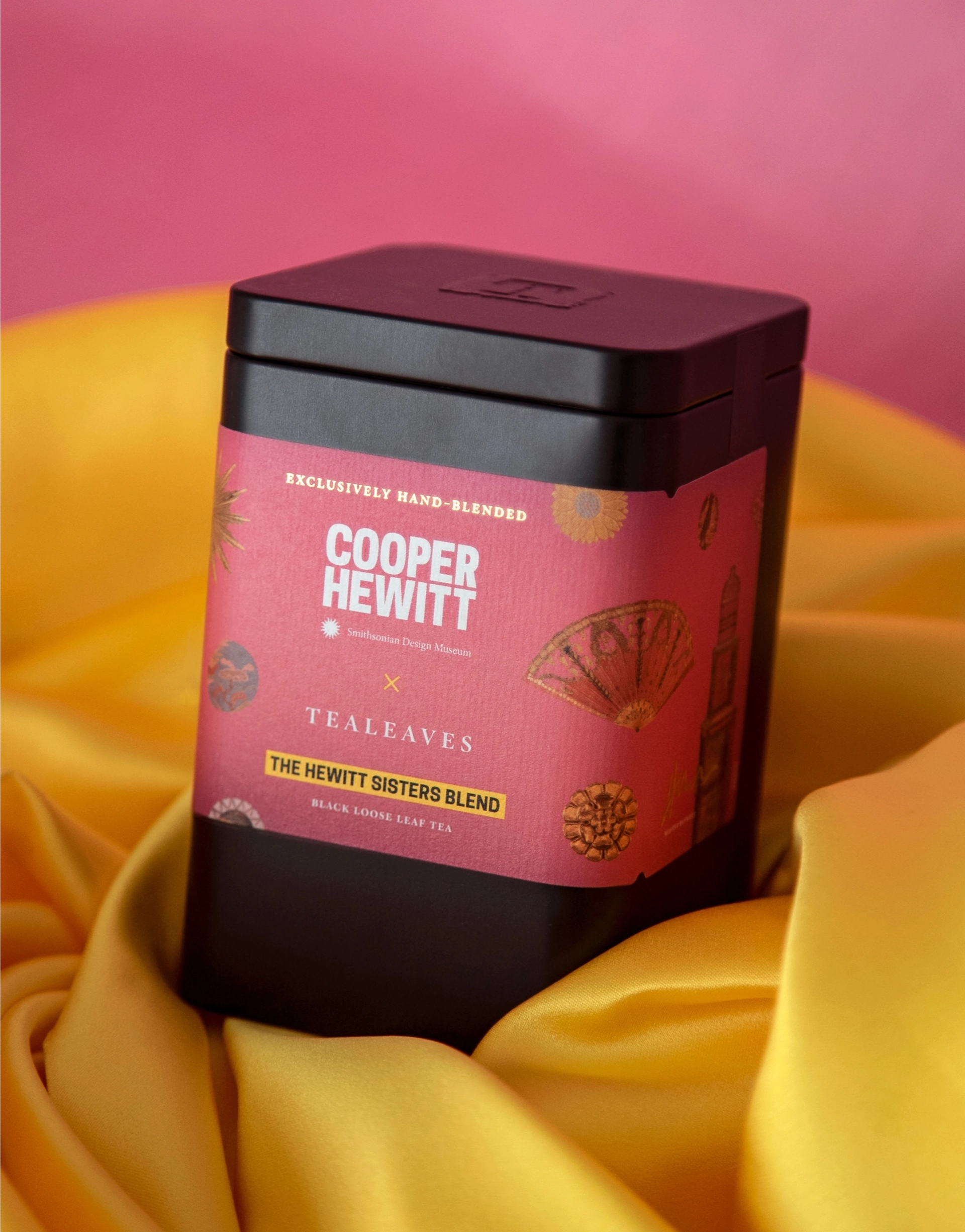
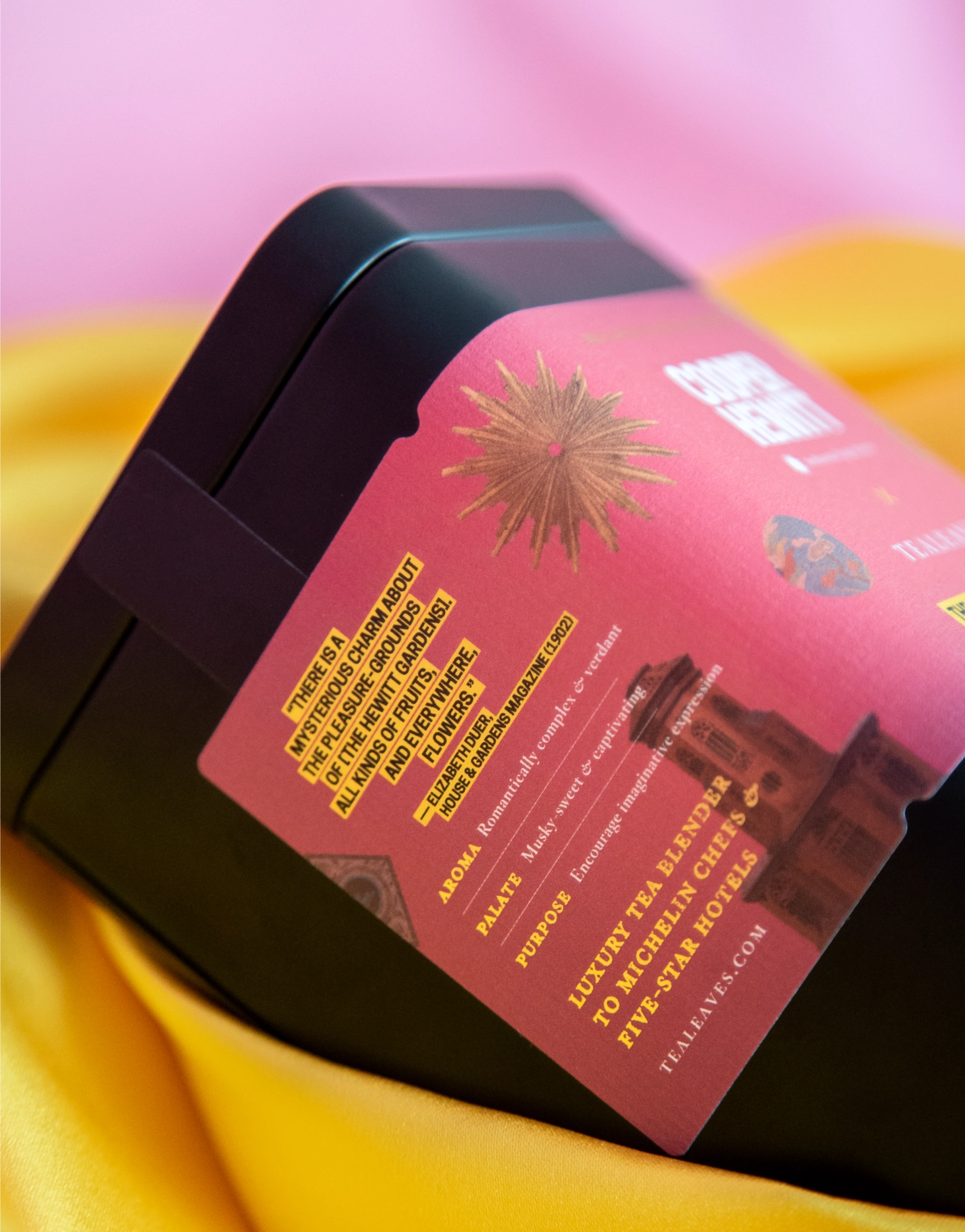
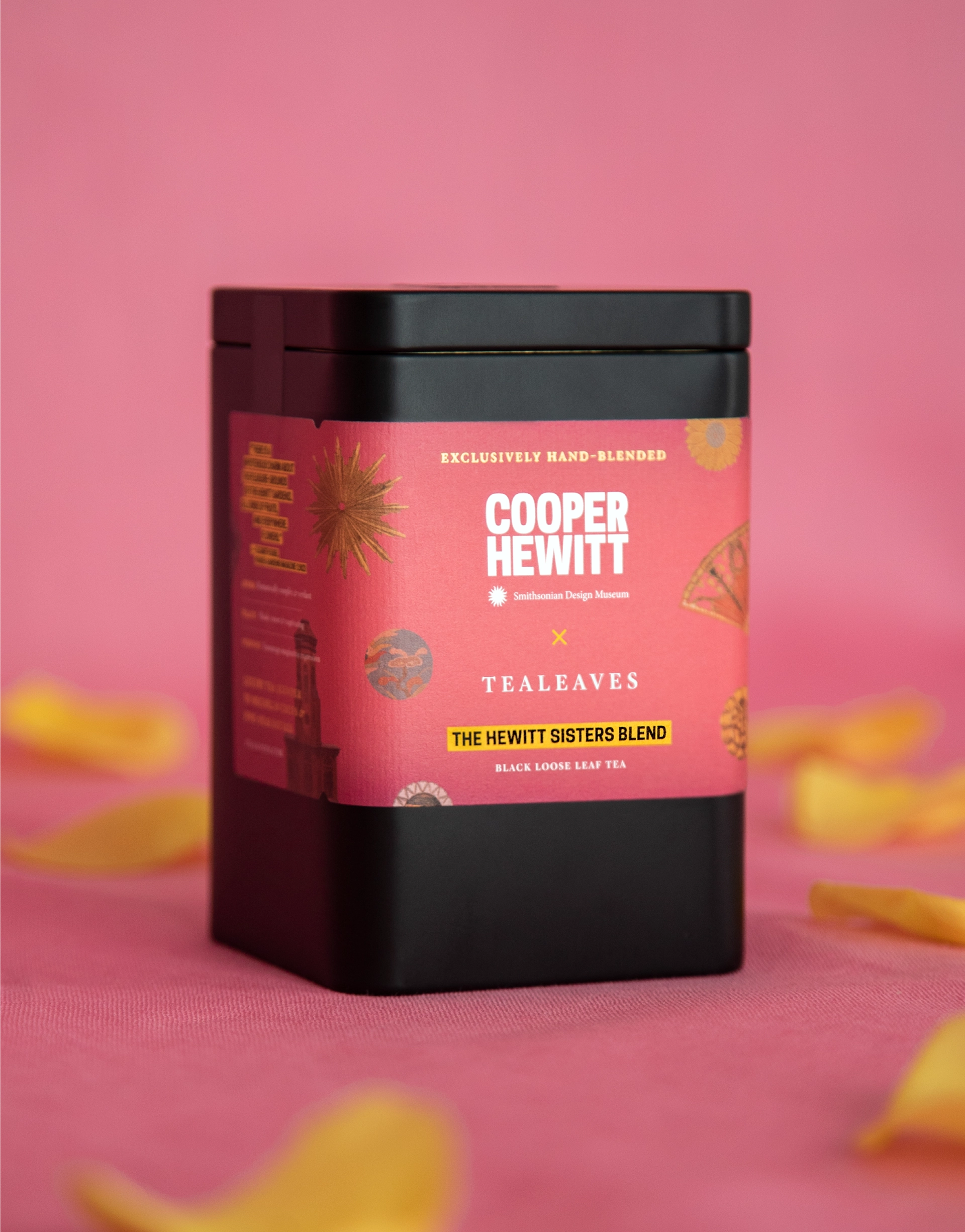
Final ProductThrough our collaborative process with Pamela Horn and the Cooper Hewitt team, we were able to create a label design that truly captured the essence of the Hewitt sisters and the museum's commitment to design excellence.
TakeawayThis was a very special project to work on. Following the completion of the label design, I was in New York for vacation and had the chance to view the exhibition in person. It was amazing to see the patterns and artwork that the sisters had collected up close, in their physical, 3D form. Being able to compare this to seeing and working with the assets virtually, via a computer screen, really highlighted the importance of tactile design elements in capturing the essence of a collection.
Overall, it was an exciting and rewarding project, and a huge honour for me to contribute to such an iconic cultural institution on its 125th anniversary. This project was an unforgettable experience and a reminder of the power of design to communicate stories and create lasting impressions.