Specific Role
Director of Design
Duration
June 2017—Feb 2018
Skills Involved
Visual Design, Branding, Graphic Design, Print Layout
Tools
InDesign, Illustrator, Photoshop
Team
Madeline Millsip, Peter Tivy, Carolyn Yip, Mary Zhai (+ 37 other lovely people)
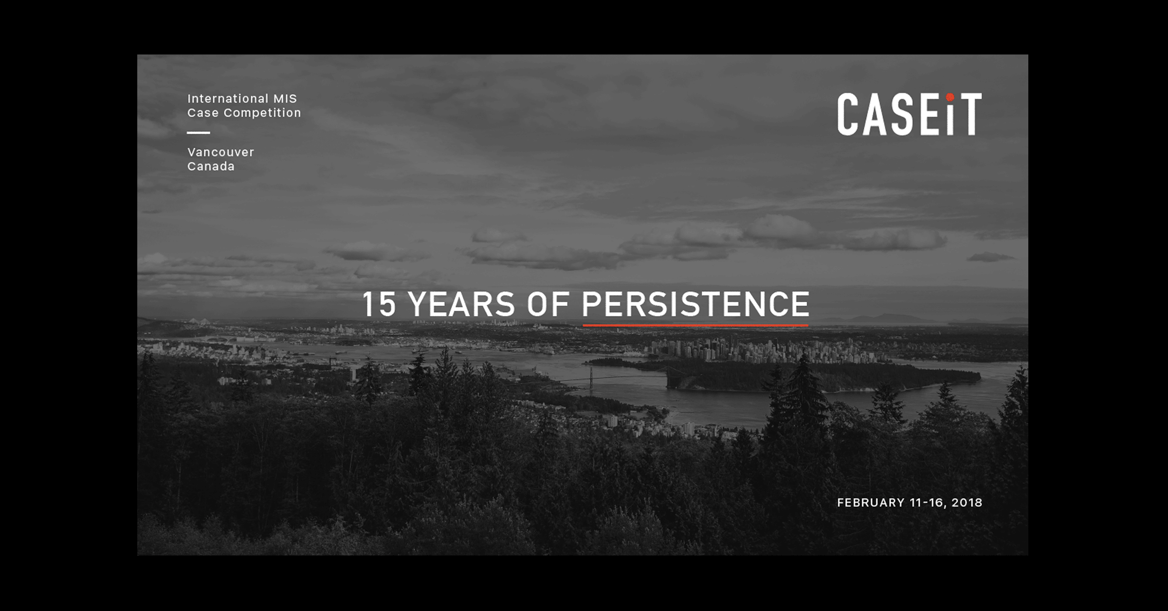
CaseIT 2018 15th year anniversary of the world's premiere Management Information Systems (MIS) business case competition hosted in Vancouver, BC.
Overview CaseIT is an international undergraduate business case competition with a focus in Management Information Systems, hosted by Simon Fraser University in Vancouver. As part of the CaseIT 2018 Organizing Committee, my role as Director of Design involved designing, overseeing, and executing the 2018 visual brand identity.
Student teams from various backgrounds around the world come to Vancouver to showcase their business knowledge, creativity, and passion by presenting a business case to a panel of industry professionals and corporate partners. For this year’s 6-day event, CaseIT had an audience of 330 attendees, including international undergraduate student competitors, industry professionals, university faculty, and local observers.
In honour of CaseIT’s 15th year anniversary, the organizing committee implemented major changes to the event in order to elevate the competition’s world-class status, transform the international competitors’ experience, and create more opportunities for these competitors to excel. This included changes to the competition case structure, corporate event, and visual brand strategy. My goal as the Director of Design was to create a cohesive brand across all forms and mediums so that I could best show off CaseIT in its milestone year.
Specific Role
Director of Design
Duration
June 2017—Feb 2018
Skills Involved
Visual Design, Branding, Graphic Design, Print Layout
Tools
InDesign, Illustrator, Photoshop
Team
Madeline Millsip, Peter Tivy, Carolyn Yip, Mary Zhai (+ 37 other lovely people)

A competing team from Chulalongkorn University, Thailand with their team host, Marilyn! Photo by Carolyn Yip

Some friendly faces of the CaseIT 2018 Organizing Committee. Photo by Carolyn Yip

Sierra Wireless Welcome Dinner at the Polygon Gallery in North Vancouver. Photo by Carolyn Yip

A keynote speaker at the Sierra Wireless Welcome Dinner. Photo by Carolyn Yip

During the Beedie Final Presentations where competing teams present their business case. Photo by Carolyn Yip

CIO Association of Canada Awards Banquet at the Vancouver Convention Centre. Photo by Carolyn Yip
BriefThe Organizing Committee wanted to reinvigorate the event for the international competitors as part of our strategy for the 2018 year. We strove to create a “WOW” effect in the many touch points competitors had with CaseIT and reinforce the brand’s reputation — from the interactions online to when competitors arrived in Vancouver.
Design DecisionsI worked together with the Marketing Team to plan the brand strategy, while I independently worked on the visual identity for CaseIT. We decided that we wanted to integrate more of SFU’s branding elements, such as type and colour, into the visual design as CaseIT has long been hosted in collaboration with the Beedie School of Business.
CaseIT’s distinction as a forward-thinking, adaptable, and challenging platform for global talent is expressed throughout their new brand identity, using a modern, sophisticated colour palette, a bold and simple logo, and patterns that draw from tech-inspired movement. I sought to elevate the brand and business-oriented event through impactful and appropriate visual design.
For the typography, I chose the typeface Din Pro because it looks all-purpose and legible. It has a straight-forward style and it's easy to use across all forms of visual communication. Din Pro is also one of the official typefaces of the SFU identity.
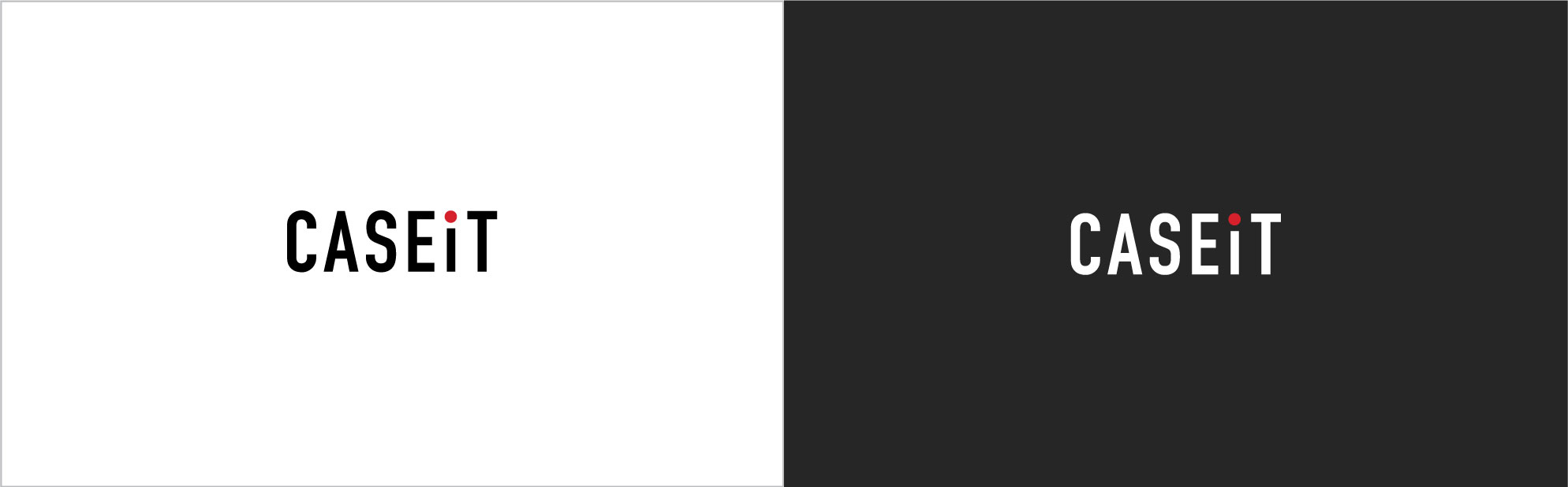
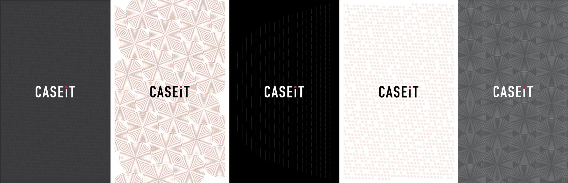
Colour PaletteI chose a monochromatic colour scheme of black, grey, and white to convey a sense of modern sophistication, intelligence, and timelessness. These hues also work well for technology and luxury brands, and could be used to establish negative space in lieu of white. Red was chosen as an accent colour because it evokes strong emotions and passion (as is needed during a competition); the red colour will also help represent SFU and Canada to other case competitions in the world. The orange hues evokes creativity and will help bring warmth to the otherwise serious colour palette.

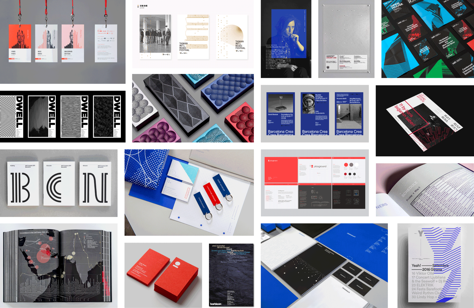
GraphicsThe variety of patterns were a subtle way to add visual interest and depth to the simple designs. I was inspired by how simple lines and points could be used to make a pattern that mimicked technology and data but in its abstract nature, also looked like it was moving, transmitting, radiating, and pulsing. I experimented with creating patterns with linear, radial, and parallel lines and manipulated their strokes, size and proportion, and space.
FeedbackA great number of directors on the 2018 Organizing Committee had previously competed or attended business case competitions, so they were able to provide great feedback and insight on what made their experiences positive and rewarding. I implemented their feedback and often sought out their opinions when creating documents and print layouts to make sure I was creating something that would be valuable and helpful for the competitors.
Final ProductThere were a plethora of design deliverables (in a variety of printed and digital communications) to be completed in the months leading up to the event. This included but was not limited to a new logo design, various sponsorship packages, name tags, place cards, buttons, social media banners, photo booth backdrop, and event programs.

Competitor's Welcome Package

Selected Spread — Table of Contents

Selected Spread — 15 Years of Celebration

Selected Spread — Signature Event (Ad provided by Beedie)

Selected Spread — Map of Competing Teams

Selected Spread — CaseIT 2018 Organizing Committee

Judging Folders

Buttons for CaseIT's 15th Anniversary — super fun to design!

Nametags

Dinner Placecards

CaseIT Sweater
TakeawayIt was extremely exciting to be a part of a team that was planning the execution of a such a large scale event and I am so glad that I got the chance to be able to collaborate with each of the 42 dedicated individuals who made up the Organizing Committee. I think what helped make this event successful was the team's willingness to work together and get things done and our collective determination to exceed everyone's expectations.
By the end of this event, I had also gotten the opportunity to view more of the behind-the-scene processes of print production, and to see the print materials I had designed in real life and used through out each of CaseIT’s multi-day events were especially rewarding.
Through this role, I was able to strengthen my time management and organization skills with the ever growing list of deliverables and deepen my expertise in branding and print design. Especially going through the craziness during the week of the competition, I also feel much more capable at adapting and working efficiently in stressful situations.